Every digital experience on the modern internet—from simple personal blogs and global news portals to complex web applications and cloud dashboards—is powered by two foundational languages. Having html and css explained from the ground up reveals how web browsers parse raw code, build visual document trees, apply styling rules, and render fluid, interactive user interfaces across desktop monitors and mobile smartphones.
While HTML provides the structural skeleton and semantic meaning of content, CSS transforms plain text into visually engaging, responsive, and accessible web experiences. In this comprehensive technical guide, we break down core elements, layout engines, and best coding practices according to official web standards from MDN Web Docs and Google Web Developer resources.

Table of Contents
What Is HTML and Why Is Semantic Structure Critical?
HTML (HyperText Markup Language) is the standard markup language used to structure web content. HTML documents consist of nested elements represented by tags that instruct web browsers on how to interpret headings, paragraphs, images, tables, hyperlinks, and interactive forms.
Modern web development emphasizes Semantic HTML—using tags that carry inherent meaning rather than generic division wrappers:
<header>&<nav>: Define top-level site branding, logos, and navigational links.<main>&<article>: Contain the primary central content and self-contained editorial posts.<section>&<aside>: Group thematic content blocks and supplementary sidebar widgets.<footer>: Houses copyright data, secondary links, and privacy policies.
Semantic markup directly improves search engine ranking (SEO) and web accessibility for screen readers, building a solid digital foundation as explored in our guide to technology for beginners and our technical overview on what is a domain name.
What Is CSS and How Does It Style the Web?
In our exploration of html and css explained, understanding Cascading Style Sheets (CSS) is essential for mastering how visual presentation, formatting, color palettes, typography, and element layouts are governed. While HTML defines what appears on the screen, CSS determines how it looks.
CSS operates through rules composed of selectors and declaration blocks:
- Selectors: Target specific HTML elements by tag name (
h1), class (.card), or unique ID (#main-nav). - Declarations: Pairs of properties and values (e.g.,
color: #0066cc;orfont-size: 1.25rem;). - The Cascade & Specificity: CSS resolves competing styling rules using a mathematical specificity hierarchy (Inline Styles > IDs > Classes > Element Selectors) to ensure predictable visual rendering.
Core CSS Layout Engines: Box Model, Flexbox, and Grid
Constructing modern website interfaces requires mastering three structural layout engines as documented by the Google Web.dev CSS Curriculum:
The CSS Box Model Explained
Every single element rendered in a browser is enclosed within a rectangular box consisting of four concentric layers: Content (text/media), Padding (space around content), Border (decorative outline), and Margin (external clearance separating adjacent elements). Setting box-sizing: border-box; ensures that padding and borders do not expand total element width unexpectedly.
Modern Layouts with Flexbox
The Flexible Box Layout (Flexbox) is a one-dimensional layout model engineered for distributing space and aligning elements along either a horizontal row or vertical column. Properties like display: flex;, justify-content: space-between;, and align-items: center; make navbar navigation and button groups trivial to construct.
Two-Dimensional Grid Systems with CSS Grid
CSS Grid is a revolutionary two-dimensional system capable of orchestrating complex rows and columns simultaneously. With declarations like display: grid; grid-template-columns: repeat(auto-fit, minmax(300px, 1fr));, web developers build fluid card matrices without cumbersome math or external frameworks, aligning with architectural patterns in types of software architecture.
Responsive Web Design and Mobile-First Architecture
With mobile internet traffic exceeding 60% globally, websites must adapt fluidly across handheld smartphones, tablets, laptops, and ultra-wide desktop monitors:
- CSS Media Queries: Use
@media (min-width: 768px)breakpoints to apply specialized desktop rules while serving lightweight mobile layouts by default. - Relative Units: Replace static pixel values with scalable relative units like
rem,em,vw, andvhto support fluid typography and zoom accessibility. - Performance & WebP Images: Serve compressed modern media formats (WebP/AVIF) with responsive
srcsetattributes to minimize mobile data payloads.
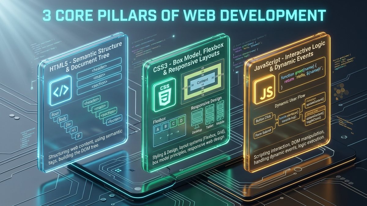
The Web Technology Stack Comparison Matrix
The comparative matrix below illustrates how the three core client-side technologies collaborate to power web applications:
| Technology | Core Function | Real-World Analogy | Standard Syntax Example |
|---|---|---|---|
| HTML5 | Document structure & semantics | Architectural framing / walls | <article class="post">...</article> |
| CSS3 | Visual styling & layouts | Paint, lighting & interior design | .post { display: flex; gap: 1rem; } |
| JavaScript | Dynamic logic & interactivity | Electrical wiring & smart appliances | button.addEventListener('click', fn); |
| Web Browser | Parses code & renders DOM | Construction team / viewer | Google Chrome, Firefox, Safari |
The Trio: How HTML, CSS, and JavaScript Work Together
When a browser loads a web page over the network—as detailed in our guide on how the internet works—it performs three synchronized steps:
- DOM Construction: The browser parses HTML markup to construct the Document Object Model (DOM) tree.
- CSSOM Generation: CSS rules are parsed into the CSS Object Model (CSSOM) tree to calculate element geometries.
- Render Tree & JavaScript Execution: The DOM and CSSOM combine into a Render Tree, while JavaScript manipulates styles and attributes dynamically in response to user clicks and keystrokes.
Best Practices and Common Mistakes to Avoid
Accelerate your development efficiency by adhering to clean code standards:
- Avoid Inline CSS Styles: Never clutter HTML with
style="..."attributes. Maintain styles in separate stylesheet files for caching efficiency. - Always Include Image Alt Text: Provide descriptive
altattributes for search engines and visually impaired screen reader users. - Keep CSS Specificity Low: Avoid excessive
!importanttags or deeply chained ID selectors that make stylesheets difficult to maintain. - Validate HTML Markup: Run code through the official W3C validator to eliminate unclosed tags and syntax bugs.
Frequently Asked Questions
What is the fundamental difference in html and css explained for beginners?
When analyzing html and css explained for beginners, HTML provides the structure, text content, and semantic elements of a web page, while CSS controls the visual layout, typography, colors, animations, and responsive screen positioning.
Can you build a functioning website with only HTML and CSS?
Yes. You can create complete, responsive, and visually stunning landing pages, blogs, and documentation websites using only HTML and CSS without needing JavaScript backend engines.
What is the best way to learn HTML and CSS fast?
The fastest way to learn is by building small practical projects—such as a personal portfolio, a product card, and a responsive navbar—while inspecting live websites using browser Developer Tools (F12).
How do HTML and CSS impact search engine optimization (SEO)?
Proper heading tags (H1 to H6), semantic HTML5 landmark tags, clean lightweight CSS, and fast mobile loading speeds directly elevate search ranking on Google.
Summary and Next Steps for Web Developers
Having html and css explained transforms web browsing from a passive activity into an empowering creative skill. By combining semantic HTML5 document structures with modern CSS3 Flexbox and Grid layouts, you can build elegant, high-speed, and accessible web experiences ready for the modern digital era.
Continue your digital learning journey with our guides on what is a domain name, explore global networks in how the internet works, or meet our technical team on our About Us overview!