
Having Web design explained with comprehensive clarity is vital for modern digital creators, entrepreneurs, and developers. Web design is the multi-disciplinary craft of planning, conceiving, and orchestrating the visual layout, user interface (UI), and interactive user experience (UX) of a digital product across all screen sizes.
A truly exceptional website is far more than aesthetic decoration with vibrant colors and bold typography. Great digital design bridges human emotion with engineering precision, integrating seamless HTML and CSS structure, dynamic JavaScript logic, and strategic SEO architecture. As documented by MDN Web Docs, modern standards ensure universal accessibility across varying device viewports and network constraints.
Table of Contents
What Is Web Design? (UI vs UX Architecture)
In this fundamental discipline, the creative field divides into two essential, complementary specializations:
- User Interface (UI) Design: The aesthetic and sensory surface of the website—including color palettes, typography scales, buttons, spacing systems, iconography, and micro-animations.
- User Experience (UX) Design: The underlying cognitive architecture—focusing on user journeys, information hierarchy, wireframing, friction reduction, and intuitive task completion.
While UI design determines how beautiful and polished an interface looks, UX design ensures that users can achieve their goals effortlessly without confusion or cognitive overload.
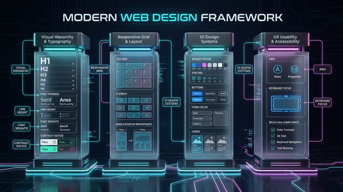
Web Design Explained: Core Principles and Visual Hierarchy
To master Web design explained from fundamental design theory, professional designers rely on several time-tested visual rules:
1. Visual Hierarchy and Eye Flow
Eye-tracking studies demonstrate that web visitors scan pages in distinct patterns (F-patterns for text-heavy blogs, Z-patterns for landing pages). By adjusting font sizes, weights, and high-contrast accents, you guide the reader’s gaze toward your most crucial messaging and calls-to-action.
2. Negative Space (White Space)
White space is not empty wasted canvas; it is a vital active design element. Generous margins and paddings provide visual breathing room, group related concepts, and elevate perception of luxury, modernity, and clarity.
3. Proportion and the Golden Ratio
Applying structured geometric ratios across sidebar widths, container grids, and typography scales creates an innate sense of harmony and balance that human psychology naturally perceives as aesthetic and trustworthy.
Responsive and Mobile-First Layout Frameworks
Over 60% of all global web traffic originates from mobile smartphones. In our exploration of Web design explained, adopting a mobile-first design methodology ensures your website delivers a flawless experience on small screens before scaling up to 4K desktop displays.
Modern layouts utilize CSS Flexbox for one-dimensional navigation bars and CSS Grid for complex two-dimensional card layouts (explore MDN Responsive Design guidelines). Fluid viewport units (rem, clamp(), vw) guarantee that typography and containers scale smoothly without rigid pixel breakpoints.
Typography, Readability, and Color Psychology
Typography and color form the emotional voice of your digital brand. When creating high-conversion websites:
- Font Pairing: Limit designs to 2 font families (e.g., an expressive Sans-Serif or Serif for Headings and an ultra-readable geometric Sans-Serif like Inter or Roboto for body paragraphs).
- Optimal Line Length: Keep paragraph widths between 50 to 75 characters per line to minimize reader eye strain.
- The 60-30-10 Color Rule: Allocate 60% of the canvas to a dominant neutral background, 30% to secondary structural cards/surfaces, and 10% to a high-contrast accent color reserved exclusively for interactive buttons and key highlights.
Design Systems, Component Atoms, and Consistency
Modern tech companies no longer design isolated web pages; they build Design Systems. In Web design explained across scalable software teams, design systems establish centralized Design Tokens for:
- Standardized color hex values and opacity tiers
- Uniform spacing scales (4px, 8px, 16px, 24px, 32px, 48px)
- Reusable interactive component states (Default, Hover, Active, Disabled, Focused)
- Consistent modal dialogs, cards, breadcrumbs, and form controls
Web Accessibility (a11y) and WCAG Standards
Accessible design ensures that individuals with visual, motor, auditory, or cognitive disabilities can navigate your site smoothly. Adherence to Web Content Accessibility Guidelines (WCAG 2.2) is both a moral obligation and a legal requirement in many jurisdictions:
- Color Contrast: Maintain a minimum contrast ratio of 4.5:1 for normal body text and 3:1 for large headers against background surfaces.
- Keyboard Navigation: Provide visible focus outlines for users navigating via Tab keys without mouse peripherals (explore our technology basics).
- Descriptive Alt Text: Provide contextual text alternatives for all informational images for screen-reading software.
Digital Design Disciplines: UI vs UX vs Frontend vs Product Design
| Role / Discipline | Primary Objective | Core Deliverables | Primary Tools |
|---|---|---|---|
| UI Design | Visual aesthetics, typography, styling, component design | Design systems, High-fidelity UI mockups, Style guides | Figma, Sketch, Adobe XD |
| UX Design | User research, wireframing, usability, information flow | User personas, User journey maps, Wireframes, Usability tests | Figma, FigJam, Miro, Hotjar |
| Frontend Dev | Translating design files into live interactive code | Clean semantic HTML, CSS styling, Responsive JS logic | VS Code, Chrome DevTools, React, Next.js |
| Product Design | Holistic product strategy aligning business goals with user UX | End-to-end product roadmaps, Full UX/UI flows, Feature specs | Figma, Jira, Linear, Mixpanel |
End-to-End Web Design Workflow in 2026
To execute professional projects successfully, follow this proven 6-stage roadmap:
- Discovery & Strategy: Define business goals, analyze competitor websites, and interview target audience demographics.
- Information Architecture: Map out the site structure, URL tree hierarchy, and navigation menus.
- Low-Fidelity Wireframing: Sketch rough monochrome layouts focusing strictly on content placement and user flow without color distraction.
- High-Fidelity UI Prototyping: Apply design tokens, typography, brand colors, imagery, and interactive clickable prototypes in Figma.
- Development Handoff & Coding: Translate prototypes into semantic HTML, CSS Grid/Flexbox, and JavaScript components.
- Testing & Optimization: Perform cross-browser testing across Chrome, Safari, Firefox, and Edge on real mobile and desktop hardware.
Frequently Asked Questions
Conclusion
Understanding Web design explained from both visual UI aesthetics and cognitive UX architecture allows creators to craft websites that captivate attention and drive conversions. By combining structured typography, responsive grids, design systems, and inclusive accessibility, you create digital experiences that truly stand out in 2026 and beyond.